How do you get teenagers excited about going to school? Young people, especially those of color, are faced with a multitude of barriers to higher education including apathy, lack of accurate information, and unclear guidance on life after high school.
Hired by the City of San Francisco, I led a team to develop and launch sfgraduate.org, a responsive web clearinghouse for current students and graduates who are interested in what’s next. My goal was to have the website connect with youth as a trusted, supportive mentor might. The visual design, illustrations, copy, and interactive elements work together to conjure feelings of hope and possibility—“Your future is beyond high school”— and help set sfgraduate.org apart from the status quo.
Visit sfgraduate.org
Credits: Deborah Lao (Creative Direction, Visual Design, UI Design & Project Management), Troy Sostillio (Development), Kristen Kong (Illustration), Leonardo Neri (Copywriting)
If knowledge is power, the public library is the free charging station for all. The design for this screenprint series takes cues from the iconic paintings of Ed Ruscha and WPA public service poster design of the 1930s and 1940s. Inspired by Robert Dawson’s photography, I wanted to share how libraries look different across communities, from a humble trailer in Death Valley to Seattle’s iconic Modernist structure. By highlighting the public library’s key role in fostering invention, democracy, and upward mobility, I hoped to rally my fellow Americans to advocate for library funding.
Winner - AIGA SF cause/affect 2011
—
Deborah Lao
Keep Our Public Libraries Open, 2011
Five-color screen print triptych
18.5" x 25"
Limited edition
Printed by Deborah Lao
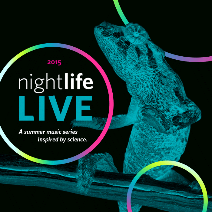
Live Music + Creatures + Cocktails = Party Animals. While exploring the new look for Nightlife LIVE, the California Academy of Sciences’ annual summer music series for those 21 and over, I kept coming back to this photograph of a lizard perched on a stick. I just couldn’t help but imagine him dancing. Using that image as a catalyst for Nightlife LIVE brand, I expanded the idea to show how other museum residents might spend a wild night with fish as wallflowers while the starfish boogie to disco. I reworked the original wordmark to function better across a variety of applications including posters, flyers, drink coasters, social media assets, digital advertising, event signage, and photobooth graphics.
Credits: Deborah Lao (Design), Rhonda Rubinstein (Creative Direction)
When I joined the Terrace project, only the renderings of the proposed restaurant in the California Academy of Sciences' west garden existed. I was charged with giving the museum’s new higher-priced dining option a distinctive identity and designing its menu and table numbers—building a brand from a building.
Beginning with the wordmark, I developed custom type inspired by the structure’s thin steel columns. Other elements of the restaurant and surroundings—the pops of blue on the ceiling, the local ingredients featured on the menu, and the natural setting of the park—brought to mind cyanotypes, the early deep blue photographs invented by botanist Anna Atkins. I foraged from the museum’s living collection of native plants and created original cyanotypes for the Terrace. I was able to expand my role to design the other aspects of the dining experience, including prototyping exterior signage and curating furniture and server uniforms.
Featured in the San Francisco Chronicle
Credits: Deborah Lao (Design & Art Direction), Alex Salz (Project Management), Rhonda Rubinstein (Creative Direction), Mark Cavagnero Associates (Architecture), Watermark Press (Printing), Thomas Swan Sign Company (Production & Installation)
Building photos by Kathryn Whitney.
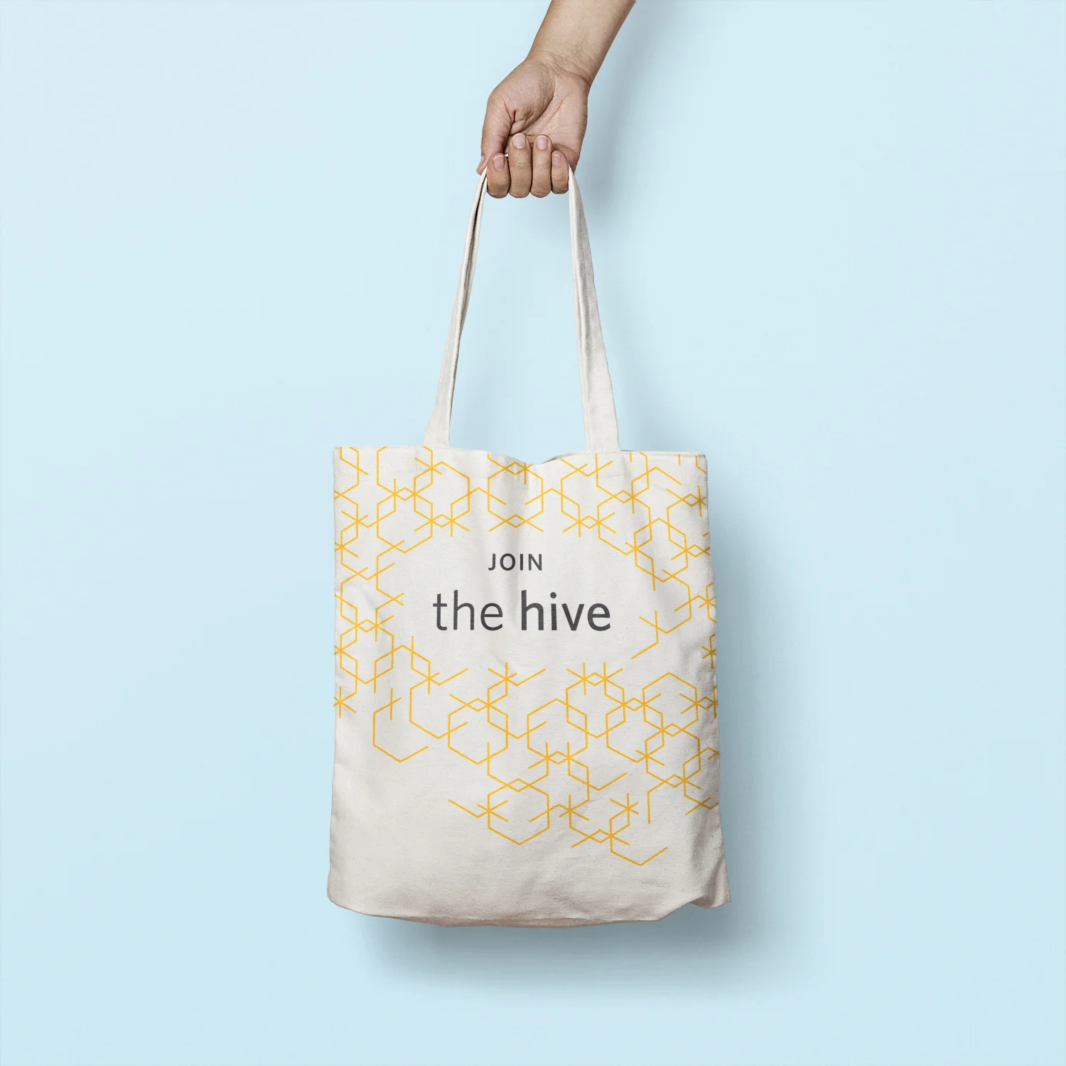
Science meets social networking for a new group of patrons. The Hive, a California Academy of Sciences donor group for ages 21-40, needed a brand to attract the interest of young technology professionals and position the Academy as a buzz-worthy science hub. For the wordmark and membership materials for this new group, I used Academy Yellow and the hexagon as core elements, and created a complementary gradient and a flexible pattern that symbolizes links coming together to form a robust community.
Credits: Deborah Lao (Design), Rhonda Rubinstein (Creative Direction)
Featuring Bruce Lee, Richard Aoki, Jeremy Lin, George Takei, and DJ QBert, Manhood: Asian America challenges mainstream media’s shallow depictions of Asian American men. These five icons, a martial arts master, a Black Panther, an NBA phenom, a prolific actor/activist, and a hip hop pioneer, are anything but meek, forgettable punchlines who never get the girl (or guy). Reclaiming pop culture's one dimensional perspective, my portraits present the five men as "superheroes" who young boys and men can be proud to emulate.
Featured on Colorlines, Angry Asian Man, and KoreAm Journal.
—
Deborah Lao
Manhood: Asian America, 2012
Three to four-color screenprint
17" x 22.5"
Limited edition
Printed by Deborah Lao and Helen Pena Lopez
Sometimes it’s okay to play with your food. The Academy Cafe remodel was an opportunity to infuse personality and wit into the popular family cafeteria space; thinking beyond traditional food photography, I wanted the wall graphics to delight weary, hungry diners. I carefully studied the menus, curated stock photography of raw ingredients related to dishes served at each location, and then let my imagination take over. The mural of artist Frida Kahlo, Karl the Fog interpreted as meringue, and the “avocadowl” are some of my favorite moments. As the lead designer on the project, I also guided and finalized illustration, designed overhead menu boards, and oversaw the production and installation of all environmental graphics.
Credits: Deborah Lao (Design, Art Direction & Illustration), Alicia Greenleaf (Illustration), Alex Salz (Project Management), Rhonda Rubinstein (Creative Direction), Sterling Graphics (Printing & Installation), Thomas Swan (Sign Production & Installation)
Restaurant photos by Kathryn Whitney and Alicia Greenleaf.
Calling all budding scientific explorers! The California Academy of Sciences Public Programs division asked me to create the look and feel for Junior Scientist Adventure, a self-guided scavenger hunt for children ages 8 and older. My solution was to present the program as a special expedition across the many worlds within the museum. I used graphics originally created by artist Michael Bartalos for the Academy as the basis of the Junior Scientist badge. For the activity guide, I illustrated tools and animals in a field sketch style. Each explorer is equipped with a kit that includes a wood pin, field notebook, certificate of achievement, and supplies to help them complete their observations.
Credits: Deborah Lao (Design & Illustration), Rhonda Rubinstein (Creative Direction)
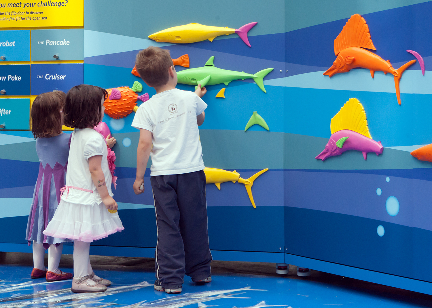
An interactive learning area, the Fast Fish Challenge was a part of the California Academy of Sciences Built for Speed exhibit of 2012. Owning the project from concept to installation, I developed layouts, put together paint schemes, and illustrated graphic panels for a set of playing cards, six walls and bouy-inspired center bin for the area's game about fish adaptation. Taking cues from the look and feel of the overall exhibit, I devised a complementary color scheme for the game cards, flip doors answer key, and the abstract ocean current pattern.
Credits: Deborah Lao (2D Design, Fast Fish Challenge), Jennifer Hennesy (2D Design, Built for Speed exhibit), Rhonda Rubinstein (Creative Direction), Jen Sparrow (3D Design), Sterling Graphics (Graphic Printing and Installation).
Exhibit photos by Daniel Furon.
When Nightlife’s new responsive website design demanded a standardized approach to images, I teamed up with a fellow designer to develop a new strategy to help them promote their weekly after-hours cultural events online. To be successful, the solution needed to be robust enough to serve as the basis for a new composition every week, nimble enough to produce images ready for mobile and desktop, and straightforward enough to be replicated by any designer on the team. And of course, it needed to appeal to the 21 and over crowd.
We devised a flexible, bold template where images can be indiscriminately cropped into squares/rectangles and paired with predetermined titles and copy online. Our solution embodied Nightlife itself: it’s a spirited party with house rules. Use circles, include images of activities and science, amplify typography, and crop creatively. Repeat.
Credits: Deborah Lao and Jinny Kim (Art Direction & Design), Christina Jirachachavalwong (Design), Alicia Greenleaf (Design), Rhonda Rubinstein (Creative Direction)